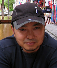
Gregory is a great model, he never moves once he sits down. I painted him a couple of years ago from the other side because there was no open space in front of him, same thing happened again the day before yesterday, I have to put my canvas on this side of him.
I know many artists like to paint from the 3 quarter view, that’s probably the best angle to create the 3D looking, but I actually enjoy painting from the side view sometimes. I know I lost some value contrast on my canvas by painting from this angle, it will be more difficult to model the forms. But on the other hand, I got more room to play with the subtle colors. Also I need to push more on the brush works to create the interest from the model, that actually helped me to capture the feeling that I got from Gregory.
An artist friend left this question in my last posting
“Its said that edges which appear hard on squinting should be retained the way they are whereas edges taht blur on squinting must be painted soft. Its been my observation that higher the value contrast across an edge, the harder it appears on squinting and vice versa. So is it correct to conclude that edges with higher contrast must be painted as hard edges while those with lower contrast must be made softer?”
I think I agree with that if we are painting what we see, less contrast will look softer, and more contrast will look harder on edges.
But the next thing we should add is what we know to our painting. For example, in this painting, I added a few dark strokes on the top of the canvas to support his white hair; I added some light strokes under his nose and chin, some dark strokes on top of his nose and forehead to support the shapes there. Those values and colors might not be there from what I saw, I used what I needed to create what I wanted…
Furthermore, most important for an artist is expressing our feelings from our artwork, that’s why I think my paintings are my language, no matter what I paint, even just a small object.

6 comments:
Excellent. This is the way I'd like to learn to paint portraits.
Thanks for all the info on value and supporting strokes. :)
Beautiful result. I thought I recognized the model. Thanks for the observations about how you used dark and light strokes in the background to support the structure of the main subject.
Thanks for your explanation of THE Edges, such comments are very usefull.
This is a wonderful portrait and your advice about strokes is right on! Fabulous work.
Thanks everyone!!:)
I often re-read your posts, and this one has helped me think through my difficulty with plein air painting, and why I get so confused when outdoors.When I study a soft meadow landscape to paint,I cannot see where 'modeling the forms' would take place. All I see are textured, loose masses with scattered forms, with little bits of shadow mass here and there. Usually the value contrasts are not great either. Unless there is a building or rock as the main focus, how do you start, and then direct, yourself in such a scene?
Your posts are always interesting and instructive- thank you!
Post a Comment